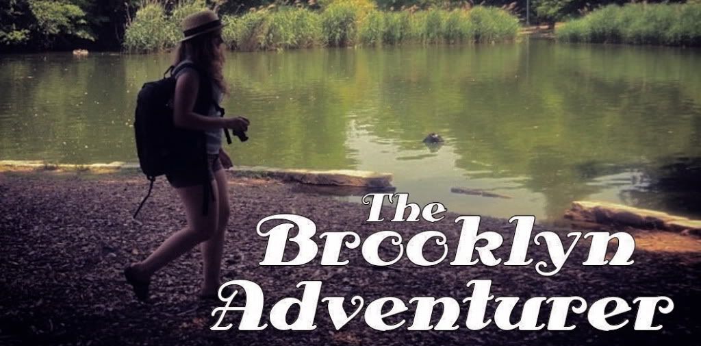
You probably noticed, but yesterday, I changed up the site design a little bit. The blue was nice and all. the white background was simple. It was classy, I guess. Probably, it was easy to navigate.
But, it just wasn't me. I don't resonate in the realm of aqua with pretty birds. I like deep reds, crumbling medieval walls, and theatrical fonts. You know those people who actually write in cursive? The ones who continued to use it even after they passed fourth grade and never were required to again, despite the rantings of your lower level teachers? I'm one of those people. I dream of living in castles and wandering through European Forests. I want to wear big hats and scarves on my head whilst sipping super-fancy lattes in tiny towns. I'm that person.
So, the new header image is a photograph of mine. It was taken in the Saint Chappelle Cathedral in Paris. The photograph was edited into sepia-tone- the actual painting, which dates back to the late 1200's, was in green, red, and a deep golden yellow. I love history, especially medieval and renaissance history. I've said this on here before, but I almost accidentally acquired a minor in the subject in college. Perhaps someday I'll research it more, not for my career, but for the sheer fun of it, because, well, I love this stuff. It's fascinating. I wish I could live it.
The background is just a stock print with a burgundy colored overlay. Simple. But, I like how the overall design invokes a theatre. I am an actor, and now an aspiring teacher of actors, after all. My idea was to play on the aesthetic of the theatre inside of Versailles. Basically, I wanted the new theme to be very French in nature. I like France. I like anywhere that has a little bit more history than the United States. Since we wiped the history of the natives of this land away, there are only a few hundred years left to study, and few signs of opulence equivalent to that of the French people. I don't know.
I just hope you like the new design. In my opinion, it fits the content and soul of this blog much better. Instead of copying the format of other blogs, it's a little bit more of me expressing, well, me.
Feedback is very, very much appreciated!
OH. And, there's a poll in the sidebar. I'll keep writing and posting what I feel like, because, you know, I'm the sole author/ photographer/ curator/ whatever of this blog, but it is decidedly helpful to have a vague idea of what it is you most enjoy seeing on here. Is it style posts? Do you relish Fridays when I post inspiration? What about my writing? Do you dig it, or find it abominable, and unnecessary? I'm filled with curiosity.
Thanks all. I appreciate that you read this blog. Thanks.
~Emily

No comments:
Post a Comment